Understanding Is Good Medicine – What We Can Learn From Barcelona’s Hospital Sant Pau
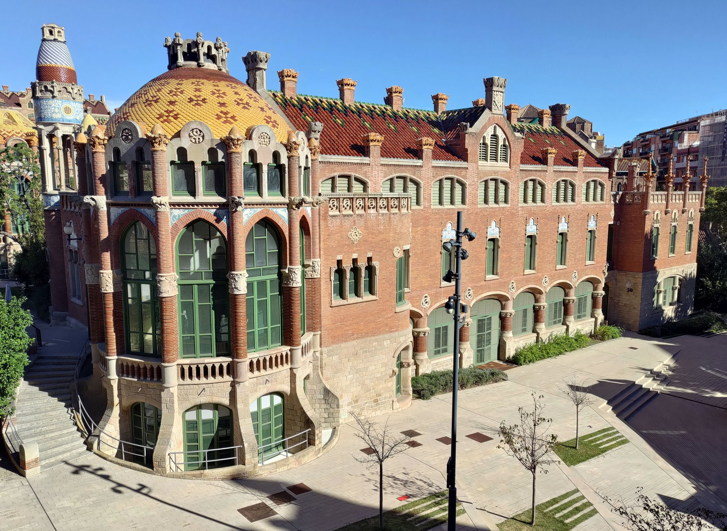
If you are lucky enough to visit the Catalan Art Nouveau architectural wonder that is Hospital de la Santa Creu i Sant Pau, your attention will surely be captured by the breathtaking details – vaulted roofs, stained glass windows, intricate tile mosaics, and lush gardens. But if you walk around and take in the space as a whole, you will see that the architect, Lluís Domènech i Montaner, designed it to be much more than a pretty place for hospital beds.

Montaner’s main concern was designing a hospital that addressed the prevailing early 1900s theory that disease was spread through “bad air.” So instead of Instead of lumping everything into one big building – the most common hospital design at the time – Montaner opted for a complex of twelve main smaller buildings separated by gardens and interconnected by underground tunnels.
The design probably did make it hard for diseases to find their way around. But just as importantly, it made it easy for people to find their way around.
There are a number of elements working in tandem to make Hospital Sant Pau so organized and understandable – what environmental psychologists call a legible environment.
The site has a clear hierarchical organization. Buildings were organized into four quadrants – separating men and women and infectious and non-infectious diseases – and each building housed a different medical specialty.
Each building was kept to a manageable size making both them and the social dynamics within them easy for people to navigate.
Everything was well connected. Two main avenues connected the four major zones and individual buildings were interconnected both above and below ground.
And although the space has a lot of visual complexity, it also has predictable patterns – buildings share the same floor plan and the consistent use of architectural details unifies the space.
The combined effect of Montaner’s legible design was a space that was rich in details yet easy to navigate and manage at both a physical and a social level. And from what we now know about the benefits of legible environments, the design – when compared to the monolithic hospital designs at the time – would have meant lower stress levels, reduced mental fatigue, reduced chance of feeling overwhelmed and helpless, and better social interactions.
In short, the design was part of the treatment.

On the perils of getting lost
Sadly, for Art Nouveau fans and human-scale design enthusiasts alike, the times have changed. Hospital budgets largely don’t have the money for beautiful yet costly architectural details. Big consolidated buildings are back in vogue. And legibility has often gotten lost in the design shuffle.
The blood lab in the large hospital that houses my medical clinic is a case in point. Once you do manage to find the lab, the real confusion for first-timers begins. The fact that you have to take a number before you start to wait seems almost purposefully hidden. And if you do manage to take a number and are finally called to box 1 or 2, it is not at all clear whether you should go to counter 1 or 2 or blood draw cubicle 1 or 2.
Every time I have been to the lab, there are people waiting in frustration without a number. Every time, there are people who go directly to a blood cubicle instead of to a counter when their number is called. Every time, a blood draw technician is interrupted and the staff at the counters give exasperated sighs.
The confusion in the blood lab may seem like a minor annoyance and perhaps that is why no one has bothered to address it. But it is more than that – it is bad medicine. There are costs to being lost, stressed, and interrupted that we cannot always see and I often wonder how the blood draw confusion ripples out across patients and medical staff.
There’s more to our environments than meets the eye
Legibility, or the lack thereof, isn’t just a characteristic of physical spaces. Our brains are our sense-making organs – they take in information and try and convert it to mental maps that help us figure out the lay of the land and navigate through it. This is true whether the “environment” to be mapped is a blood lab, information from one’s doctor, or the medical system in general.
Usually, we’re not even aware of how hard our brains work to translate information to understanding until there’s a problem and we end up getting frustrated, getting stressed, getting it wrong, or just deciding to get away.
When I made the move to Spain, my lack of a mental model for how the medical system worked was a significant source of stress and also meant that I delayed making appointments.
The pressure for doctors to speed through appointments can lead to overloading the patient with information or to giving advice without enough context. This not only results in a bad experience but also leads to patients making uninformed decisions or not following through with treatment plans.
And let’s not even get started on the problems with some health insurance companies where lack of legibility in their systems – ever-changing codes for tests and procedures, difficulty reaching an actual person to talk with, confusing web sites, overbilling with no apparent solution – seems to be considered a design feature rather than a bug.
Legibility is good medicine
Our brains are generally good at building the mental maps with which we understand the world. But it helps immensely if the environment itself is organized to make map-making easier. When I’m discussing things with my doctor, for instance, I need to know what’s going on at a level of complexity that gives me enough information without overwhelming me. I need the information presented to me in manageable chunks or categories. I need some clear pathways through the thicket of information and recommendations so that I know where I’m heading and can predict what’s coming.
I recently went in for a routine yet unpleasant medical test that I wouldn’t describe as a beautiful experience – there were no arched ceilings or intricate tile mosaics to distract me – but it was a beautifully constructed experience. The physical space was well-signed and organized, but it was the design of the information environment that stood out.
I was given clear written instructions well before the procedure that gave me both a general orientation to the test and detailed information organized into manageable sections. When I checked in, I was given the kind of information that helped me to mentally map both the space and the procedure. I was told where to wait, where the bathrooms were, where my number would appear, where to go next, what would happen when I got there, and how the results would be communicated. The whole experience – from start to finish – was designed to support understanding. And while my increased understanding probably didn’t affect my test results, it did affect my stress level and my willingness to return when the time comes for the next test.

Creating a more legible world, one environment at a time
Of course, the good medicine of legibility extends beyond healthcare environments. A city or neighborhood that is legible feels safer and encourages walking and social interaction. A political system that is legible gives people a foothold for engagement and participation. A talk or workshop that is legible is more likely to be translated into understanding and action.
But the ease with which one can navigate legible environments belies the effort and thought that goes into their design.
When we care about helping people find their way in a particular environment, our first instinct is often to tell them everything we think they need to know. But a better place to start is by asking the question: How can I help people create a map of this territory I wish to share?
What level of complexity is appropriate for this particular group? How can I organize the information so that people can engage with it without becoming lost or overwhelmed? How can I create clear connections from one idea to the next? And finally, what kind of signposts or landmarks can I give people so that they can explore without getting lost?
Of course, it helps if you can also design your information to be interesting and attractive – compelling stories, lovely images, a pleasing layout, and other design equivalents of Art Nouveau architecture. But like Montaner, the best designers know that when designing for people the beautiful details only work if they are laid over a solid legible foundation.
Related Posts


